BI Discipline: Data Modelling
Concepts to know before reading this article: Data Model, Denormalized Data
Concepts covered in this article: Fact Table, Dimension Table, Star Schema, Columnar Storage, Cardinality, Normalized Data
New Here? Read the Post that Started it All, and check out the Learning Map

In our previous article we went from a daily sum-of-sales table to adding more detail (increasing the grain or granularity). We added detail by adding columns, which ended up adding rows. This ballooning of rows could continue to the point of becoming completely unworkable. So, we tried a different solution. Instead of each row being a sum of some value, what if we just added a row each time something happened? In this new table, each new column added a detail category. We ended our last article with that table (Table 5). I’ll use that table (relabeled ‘Table 1’) as the starting point for this article:
Table 1

Another way we could describe this table is a table of facts, being events that took place. Rather than a ‘table of facts’, us BI pros (or Junior Analysts, in my case) simply call it a Fact Table.
Challenge 1: One Big Flat Table (all the facts and dimensions in one table) isn’t actually easy for humans to work with
One big flat table isn’t fun to work with. Let me explain. Table 1 currently has only one column for customer information. We could easily have 30 columns that relate to customer: first name, last name, street address, state, country, zip code (there are even more categories needed to completely capture address), education level, birthday, age, date of first purchase, income level, household size, favorite flavor of ice cream (yes, I know we’re crossing into potentially creepy territory here, but also I think the world would be a nicer place if more people knew my favorite flavor of ice cream. It’s a toss-up between rose and cardamom, by the way). Efficiency is all about segregating categories of information, so when we’re searching for something, we’re not having to sift through a bunch of noise.
As it turns out, we have two broad categories of information here:
- The category of events that took place
- The category of attributes or qualities of each event
The category of attributes can also be split up further into subcategories, for example: customer attributes, product attributes, and any other subdivision that makes sense.
- The category of events that took place
- The category of attributes or qualities of each event
- Subcategory 1
- Subcategory 2
- …
Challenge 2: Adding more rows doesn’t create processing problems, adding too many columns will
To explain why this is true, we’re going to get a little technical. Give it a shot, and trust that in the end, you’ll need to understand only the gist of what follows, along with the above principle.
At first glance Challenge 2 seems counterintuitive. If I have a 7×4 table (7 columns, 4 rows), shouldn’t that be the same amount of data as a 4×7 table (4 columns, 7 rows)? That was my first intuition- each table has 28 cells. The missing piece is columnar storage, a popular practice among BI tools and analytical databases. Exactly how programs compress their data is proprietary, so we can’t exactly look under the hood, but we can understand what’s going on using the principles of columnar storage. Let me show you with some examples, starting with a single-column table of numbers sorted lowest to highest.

We can compress the table at the left as follows:

It might not seem that we’ve saved space, but imagine for a moment that our one-column table had 300 1s, 700 2s, and 500 3s. The original table would be 1,500 rows long, and yet our compressed table would be the same 3 rows. The size of the compressed table depends on the cardinality of the first table. A 1,500-row table with only 3 unique values has low cardinality. A 1,500-row table with 1,500 unique values has high cardinality (and can’t be compressed any further using this method).
It’s important to note that our one-column table was sorted before we compressed it. If it weren’t sorted, it could still be compressed in the same manner, but the compression is much less efficient. The unsorted table and the resulting table might look something like this:


It’s much more efficient to compress a sorted table. Now, what if our starting table has two columns of related data?

How can we best compress this data? We can’t sort both columns at the same time while maintaining the relationship between the data, so we’ll need to choose one to sort by. Sorting by the first column yields no gain in efficiency, but sorting by the second column does:


Again, you can imagine that in a table with thousands of rows, the savings will be significant. It also may be clear from the example above that it’s most efficient to sort by the column with the lowest cardinality. Without user input, software engines attempt to determine the best sort order, and decide based on a sample of the data.
Now, imagine adding more and more columns to our example. With each new column of data, the odds of having rows that are duplicates of one another decreases, and our ability to compress the data similarly decreases. Basically, cardinality increases, which is bad for compression. That’s why adding more columns creates processing problems, while adding more rows does not.
*whew* We’ve made it through the semi-technical explanation. I’ve included it here because it’s what I needed to put my mind at ease. To summarize: a table can grow long, but not wide. Wide tables are probably going to give you more problems than solutions.
Solution to Challenge 1 and 2: The Star Schema
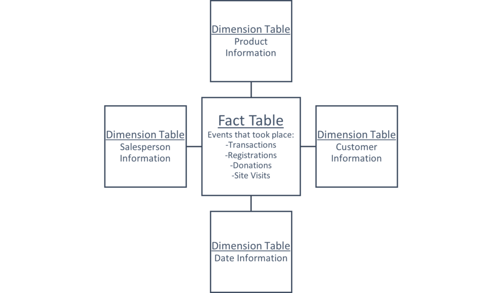
Rather than try and fit all the information into one table, what if we split it into multiple tables? The resulting tables can follow the logic we used in Challenge 1 above – one table of events that took place (known as the fact table), and many tables containing categorized details about each event (known as dimension tables). This organization of information is called a star schema.
sche·ma
/ˈskēmə/
noun
TECHNICAL
- a representation of a plan or theory in the form of an outline or model.
“a schema of scientific reasoning”
Here’s the star part, with some examples of the kinds of data that could live in the star:

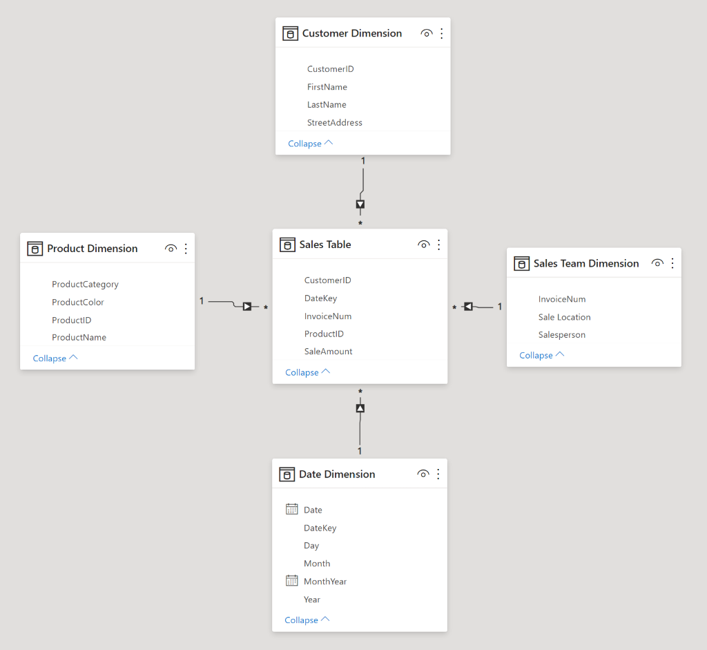
Let’s see how Table 1 from the start of this article could get split out into a star schema, while adding a couple columns for good measure ((that’s a pun for more experienced readers – ‘measures’ perform some calculations on the data) this is a joke explanation for people who get a kick out those as well).

When separating data into facts and dimensions, we want to follow the rule of one business entity, one table. Business entities can range from customers, to products, to workers, to teams, to projects, to buildings. Note however that it is possible to get carried away with too many dimensions. I’ll provide an example: You sell widgets at many locations, so location is an entity. You make a dimension table. Your buildings have different sizes, so size category is an entity. They have different cooling systems, so that’s an entity. They’re painted different colors, so color is an entity… these examples are more obviously specious, because we’re talking about features that businesses normally don’t run data analysis on. It’s also easy to imagine all this related data in one table describing the buildings where you make sales. It can easily be included in the same location table.
A Brief Summary of Normalization

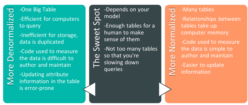
The process of surviving high school er- I mean, splitting data into multiple tables, is part of normalization. It’s helpful to think about normalization and denormalization as a spectrum. There are extremes at either end – the One Big Table from earlier is an example of a fully denormalized model. On the other end is a fully normalized model (the example in the previous paragraph of a building size table, a building cooling system table, a building color table – that’s getting close to a fully normalized model).There are codified stages to get to a fully normalized model, called normal forms. There are six of them, and if you’re a database administrator, they’re worth knowing. In the BI world it’s more useful to understand that we can move towards either end of the spectrum to accommodate our needs. There are pros and cons on both ends of the spectrum. Let’s go over some of them.
Size of the Model
The more denormalized a model is, the more duplicate data you have. For instance, if each of my customers purchases on average 20 products a year, each of their names will show up in a fully denormalized table 20 times a year, once per sale. If I normalize the model and create a customer dimension table, each customer will only be listed once there (their name will still show up once for each sale in the fact table). If we only had one attribute we tracked relating to customer (their name), we wouldn’t need to normalize. However, when each customer also has 29 other columns with related information (remember address columns, education level, income bracket, favorite ice cream), we’re able to move all of those columns to the customer table (where each customer exists only on one row) and save an immense amount of space. As a secondary benefit, if we were to update information about a customer, we’re only updating one row. In a denormalized table where the same information is repeated on hundreds of rows, we’re updating that information hundreds of times, and hoping that the update is error-free.
Fewer Tables Means Fewer Relationships
We haven’t yet covered relationships explicitly in this series yet. For the moment, know that relationships link tables together on one attribute, so that one table can filter another table. By selecting a customer in the customer dimension table, you can filter the sales fact table and see only the sales made to that customer. Without relationships, we would need to write code to measure the data. We could still filter the fact table to see sales to a specific customer, but depending on the questions asked, the code can quickly become opaque and hard-to-maintain.
Fewer Tables Means Fewer Tables
Relationships are powerful tools in data modelling. However, they also take up space in memory (something we’ll explain in greater detail when we talk about model sizes). Additionally, more tables are simply harder to manage. I could easily triple the number of tables in the star schema example above, but I would only be making my life harder. It’s like instead of keeping your socks in one dresser drawer, you have 4 dressers, and each one has a drawer with a specific color of socks. You can imagine that this sock setup wouldn’t make it much easier to count the number of socks of each color you own, and it definitely wouldn’t make it easier to count how many socks you owned in total. Though, if you’re putting your socks in different dressers based on sock color, I’d imagine you’re the kind of person who knows exactly how many socks you own. Regardless, when it comes to data models, don’t be that kind of sock owner.
The Normalization Spectrum

After quite a bit of information ingestion, I think it’s time for some rest and integration. In the articles up to this point we’ve talked about the roots of business intelligence, we’ve presented an overview of basic data models, and we’ve added complexity to the model, upgrading it to a star schema. As a digestif, I encourage you to think about your own endeavors, and how they might be best represented in a data model. Perhaps you work for a nonprofit that deals with donors rather than customers. Maybe you perform research and deal more in instrument readings or research participants. Maybe you’re in charge of a community sports league and the players want to track their stats or better understand game attendance. See if you can organize the data into a star schema (as a note of encouragement: 99 times out of 100 the data is best represented by some kind of star schema). Get up, walk around, stretch, celebrate, and tell your favorite dog (be honest, we all have favorites) all about what you’ve learned. Come back to your notes after a day and see if you have any questions.
Sign up to receive email notifications when we release new learning content
Sources
- Data Modeling for Power BI – Online Course from https://www.sqlbi.com/
Leave a Reply