Tag: Data Modelling

  • The Post that Started it All: What is Business Intelligence?

    Concepts covered in this article: Business Intelligence, Four Broad Disciplines


    Whenever I answer the question “what do you do for work?”, the next question I typically get is “what’s business intelligence?” Since those two questions are the very same ones that started me on my journey in this field, I thought it’d be an appropriate place to start this series of articles. 

    Business intelligence is about having the right information at the right time in order to make informed decisions for your business. The form this information takes can vary widely – ranging from a piece of paper you carry in your pocket, to bank statements, all the way to a set of digital reports that update automatically and answer all sorts of questions. Business intelligence (or, as I’ll refer to it often here, ‘BI’) doesn’t have to apply just to business either; the same tools used by retailers and manufacturers can be used to support public health decisions, research projects, nonprofit causes, or personal goals. 

    The above definition is what the users experience, and what we at Source to Share work to provide. However, there’s a whole world going on underneath the final reports that the user doesn’t see. That world can be separated into 4 broad disciplines that progress naturally from one to the next. 

    Four Broad Disciplines of Business Intelligence 

    1. Data Prep 
      This is usually the first step in any sort of BI process. Data prep usually starts with literally finding the data (it isn’t always in one place), then looking at it to make sure it’s valid. To prepare the data for modeling, oftentimes it will be changed from one format to another, and tables will be combined, split apart, and/or cleaned up. Then the whole slew will be loaded into reporting software. 
    1. Data Modeling 
      This is the practice of organizing data into meaningful groupings (customers, products, sales, etc.) and defining relationships between them. The modeling we engage in is called ‘semantic modeling’, and it enables users to easily locate data (or attributes) and navigate their relationships. 
    1. Data Measurement 
      This is the practice of overlaying computations on the dataset. This could be as simple as summing up sales so we can know just how many widgets we’ve sold (and comparing that to our widget budget), or as complicated as forecasting how many widgets we expect to sell next spring. 
    1. Data Visualization 
      This is an often-overlooked discipline in BI, but VERY important. Not all visualizations are equally useful, and some, like the common pie chart, are as overused as they are ineffective at conveying information accurately. The reports created in this step are what’s used to drive decision-making, and there is both a science and an art to creating useful, beautiful reports. 

    It’s important to note that during a BI project, we’ll often jump around from one discipline to the next. After some basic data prep and data modelling, we might start mocking up some crude visualizations. As we run into challenges creating reports, we’ll work to solve them at whatever stage is best. Often it is much more effective to solve problems upstream, which is the topic of an entire article later in this series. 

    I created this article and the rest of the series as I tried to answer the question ‘what is Business Intelligence?’ in greater and greater depth. They’re designed as a learning tool for myself and others – a way to document my learning and create a space for the rest of the crew at Source to Share to give feedback and fill gaps in my knowledge. 

    Who am I anyway? 

    The titular question of this post is what started my journey with business intelligence. I was at a party, and I asked my future coworker Bo what he did for work. He said business intelligence, and I bet you can guess my next question of him. I was drawn in. Several months later I was asking the Source to Share crew if they needed any extra help. 

    Before I got involved in BI, I had been running operations at an arts nonprofit. During my time there I learned bookkeeping, accounting, finance – I even filed their taxes. My education and experience had been what I’d describe as BI-adjacent. In school I studied psychology, and I focused on study design and quantitative methodology – the how and why of doing statistical analysis. I had always been intensely interested in data, data visualization, and how common errors in either could lead to misinterpretations with often serious consequences. 

    When I started at Source to Share, I was brought on to learn the BI ropes and help with the increased demand they were experiencing – and then COVID-19 hit. I shifted from learning while looking over the shoulders of our Senior Analysts to learning from afar. We discussed me documenting my BI education as a learning tool, and thus this series was born. 

    Another facet of my life that’s important to mention – I’m a licensed counselor in Washington State. My training in communication and emotional literacy help me connect with clients both in the counselor’s office and in the BI office, and those skills serve as a scaffold for these articles. 

    A Note About How Best to Use These Articles 

    These articles were born out of our collective desire at Source to Share to create learning resources that contribute to the BI community. They track my learning adventure, documenting the topics that were foundational to my growth as an analyst. They provide a sequential pathway to grasping the ‘big picture’ of the field of business intelligence. You can zoom out and take a look at the map here. 

    It’s important to note that I didn’t learn BI on my own. Self-directed study was a big part of my journey, but throughout the entire process I was aided by my coworkers Bo and Derek. Both are deep wells of knowledge and experience, and I often call them (remember, COVID-19) at all semi-reasonable hours of the day with questions and to check my understanding. These articles are written to reflect that. I cover topics to the best of my knowledge, while Bo and Derek add important technical detail, nuanced corrections, and personal flair. We’ll make sure to highlight who’s talking with text boxes. 

    Each article starts with three very important lines of text: 

    1. The Discipline of Power BI this article (roughly) falls under 
      The disciplines (from above) are Data Prep, Data Modeling, Data Measurement, and Data Visualization. Some articles will span multiple disciplines – in practice they overlap constantly. 
    2. Concepts to know before reading this article
      The concepts that make up the business intelligence world build on one another. Once we’ve covered a topic with an article, we’ll assume understanding of that topic in future articles. If you see terms here that you aren’t familiar with, go back and read the related articles. The learning map can help you find the article you’re looking for. 
    3. Concepts covered in this article 
      This line lists which new topics we’ll be covering. I encourage you to organize the notes you take around these headers. Speaking of which, I encourage you to take notes (and I’ll be reminding you to do so throughout).

    At the end of each article I’ll Share a list of Sources (see what I did there?) that helped me learn so that you can engage in your own further research. Of course, becoming a professional in the field requires additional study and practice. However, it’s my hope that anyone who really digests these articles will gain a deep understanding of the vocation and carry with them a logic that they can use to reason their way through any BI challenge they face. 

    I also strongly encourage you to take it slow. These articles weren’t written in a day, and they weren’t designed to be consumed in an afternoon, or even a week. Gaining confidence with business intelligence concepts takes consistent, measured effort. Give yourself time to write notes, integrate what you’ve learned, take stretch breaks, and even share what you’ve learned with others. Bon voyage! 


    Sign up to receive email notifications when we release new learning content! 

    Sources 

    1. Derek Rickard: Founder, Consultant – Source to Share 
    1. Bo Stewart: Analyst, Consultant – Source to Share 
  • What is a Data Model?

    BI Discipline: Data Modelling 
    Concepts covered in this article: Data Model, Table, Denormalized Data

    New Here? Read the Post that Started it All, and check out the Learning Map


    ‘Data Model’ was one of those terms that often ends up being a barrier for people who are interested in business intelligence. We get excited about organizing information and creating some standardized use of it, we go on the internet for ideas and best practices and find ourselves immediately in the weeds. The second result on a google search of ‘data model’ yielded me:

    Data modeling is the act of exploring data-oriented structures. Like other modeling artifacts data models can be used for a variety of purposes, from high-level conceptual models to physical data models. From the point of view of an object-oriented developer data modeling is conceptually similar to class modeling. 

    Oof. You had a hunch that your blue widgets were selling better in the summer (it’s already widely known that the red ones do best in late autumn). You wanted to check your hunch, and you couldn’t figure out how to easily get that information from your records. With some historical data, you’d be better informed about which color of widget to market this summer. After some light Wikipedia reading, you ended up googling ‘data modeling’. You weren’t trying to go back to school, or at least, you were hoping to have one of the fun, approachable professors who greets you at the door and wears funny hats. 

    Definitions like the one above obscure the foundational simplicity of data modelling; we’re already engaging with them every day! Even though the ideas of tracking information, putting that information in a spreadsheet, and then doing calculations on that data come naturally enough, those actions aren’t thought of as creating and acting on data models. Trust me, they are. 

    Data models can be complex, but they don’t necessarily need to be. A list of products sold with the date of sale and information about the product is a data model. A list of donors is a data model. Heck, the grocery list languishing on your fridge is a data model. In the blue widget example above, you could check your hunch quickly if you had a list of all your widget sales, the date of the sale, and the color of the widget sold.

    Data models become more complex when the questions become more complex, more time-sensitive, or we want to ask many different questions of the same data model. Each of those challenges shaped the landscape of data modelling, and the solutions to those challenges became the weeds we wade through. And we’re not going to ignore the weeds, but for the moment we’re going to step around them, gain some higher ground, and get a bigger, clearer picture. Don’t worry, we’ll come back. 

    Imagine for a moment a table. No, not the dinner kind. Okay, good mental exercise, but I can see how this can easily go astray. In order to be precise, I’m going to need to show you: 

    Table 1

     Column 1 Column 2 Column 3 Column 4 … 
    Row 1      
    Row 2      
    …      

    Tables are one way to organize information and show attributes of events. Simple, I know. But simple things are often poorly described or skipped over entirely. Let’s start to fill in the table. 

    Table 2

    Date Amount … … … … 
    01/01/19 $35     
    01/02/19 $63     
    …      

    Table 2 has some sample data organized in a typical way. The first row is special; it contains the headers that name each of the columns. Each row that follows is a unique record, in this case an entry for the total sales each day. Each column is a field, where the attributes of each unique record are listed. 

    With Table 2 we can ask questions like: 

    • What was our highest sales day in the past year? What was our lowest? 
    • What was our total sales for the Month of January this year? How does that compare with the previous January? 

    What if we sold more than just Widgets? Maybe we sell cool Widget Merchandise (or “Merch” if you were in a metal band in high school like I was): 

    Table 3

    Date Product Category Amount … … … 
    01/01/19 Widget $20    
    01/01/19 Merch $15    
    01/02/19 Widget $53    
    01/02/19 Merch $10    
    …      

    Now we’re collecting some data! We can find out what percentage of our sales are from widgets, and what percentage is driven by the fervor for widget merch that’s gripping the public. But, we still haven’t answered the question that got us into data modeling in the first place – checking the hunch about blue widgets. So, we expand our table again, getting a finer grain detail (if you’re wondering why the word grain has been bolded, good! Keep that curiosity simmering): 

    Table 4

    Date Product Category Color Amount … … 
    01/01/19 Widget Red $17   
    01/01/19 Widget Blue $3   
    01/01/19 Merch  $15   
    01/02/19 Widget Red $53   
    01/02/19 Widget Blue    
    01/02/19 Merch  $10   
    …      

    Sidebar: The Case of the Invisible Data
    You, astute reader, might have also noticed that there are holes in our data. We’re lucky enough in this example that the row on January 2 with $0 in Blue Widget sales was recorded. It’s entirely possible that our system only records rows with nonzero sales amounts, and that can be problematic. I’ll be covering this topic in The Case of the Invisible Data. No need to worry about it now. Being the excellent tour guide that I am, I’ve created a linear path that will take you there in due time.  

    Now, assuming we keep good records, we can finally check the hunch that blue widgets are a summer fad. Data Modeling success! If your questions are simple, so too can be your data models. Take a moment, pause, and drink in this foundational knowledge. Now would be a good time to stand up, reach to the sky, give your body a good shake, and go share what you’ve learned. I’m serious. I’m cementing my learning by writing these articles, and you too can do the same. Tell your dog all about it, dogs are excellent listeners, and they don’t mind hearing about the basics. 

    Challenge 1: We start asking more questions of our data, which requires finer grain 

    You may have noticed something somewhat troubling in the above example. In order to ask more questions about our data, our table seems to be growing in width but also length. Over the same date range with the same total sales, we went from 2 unique records to 6. Now, imagine if widgets came in 12 exciting neon colors, and we had 5 locations where we sold widgets. You can imagine how the table will start to grow. To top that, we haven’t even added customer data to our table. 

    If you’re just starting out, it’s likely you’re keeping your data in a program like Excel. I’m going to out myself here. When I was in high school (in that bizarre time before widespread internet access), I once was wondering just how long a spreadsheet could get in Excel. So, being the direct learner that I am, I literally scrolled to the bottom. It takes a minute, or at least, it did the way I was scrolling. At the bottom, I saw it: 65,536 rows. We’ve come a long way, and Excel’s up to 1,048,576 now. Let’s do some quick math: 

    12 colors of widget plus 6 categories of merch, times 5 locations, times 365 days a year = 32,850 rows per year 

    Back in 2003 we would have run out of space in two years. In the modern version of Excel we’re running out of space in just under 32 years, and again, our table is still pretty simple. 

    It turns out, there’s a solution to the exponentially growing table problem (there are actually several, and we’ll be covering a number of them in these articles). One of the easy solutions is just use a program that can handle more rows. Power Pivot, Power BI, and SQL Databases can all handle hundreds of millions of rows. There’s also another way that we can organize our data, and that’s what I’d like to cover next. 

    Solution 1: One Big Table to Rule Them All 

    You may have noticed in the widget examples in Tables 2-4, we’re still summing up sales every day. What if, rather than designing a set of bins that daily widget sales fall into every day, we just add a row every time we sell a widget (or piece of merch) with details about the sale. Record-keeping won’t be too onerous; computers can handle this for us. On each row we list the sale along with all the relevant details. 

    Table 5

    Our new table won’t balloon in size as we add details. We just add new columns for the new detail categories and begin keeping records. You can imagine adding a location column, a salesperson column, and a customer zip code column. Keep dreamin’, it’s all within your reach. For some operations, this is actually a pretty great solution. We won’t run out of space in Excel until we surpass 1 million units sold. At that point, we’re probably already upgrading to more robust and versatile data models anyway. 

    By the way, data organized in this way is what’s called fully denormalized. When a human (or a computer) is asking questions of the data, there’s only one table to look at. This can be easy for both the human and the computer (unless the table has too many columns, something we’ll cover in the next article). Denormalization has its drawbacks, which is why the process of normalization was invented. We’ll cover that in the next article. 

    In a broad sense, we now know what a data model is. We can speak to some of the challenges encountered as we begin asking more complicated questions of our models, as well as some of the solutions that address them. Time to go take a stretch break! Stand up, run around, go share what you’ve learned!


    Sign up to receive email notifications when we release new learning content 

    Sources

    I want to draw the reader’s attention to the resources available at SQLBI. All my foundational knowledge (and the foundational knowledge of the other people I’ve learned from) comes from Marco, Alberto, and Daniele. They are BI educators par excellence, and I cannot recommend them highly enough. 

    1. Data Modeling for Power BI – Online Course from https://www.sqlbi.com/ 
    1. Medium article on Normalized vs Denormalized Data: https://medium.com/@katedoesdev/normalized-vs-denormalized-databases-210e1d67927d 

  • The Challenges of a Single Table, or: A Star is Born

    BI Discipline: Data Modelling 
    Concepts to know before reading this article: Data Model, Denormalized Data
    Concepts covered in this article: Fact Table, Dimension Table, Star Schema, Columnar Storage, Cardinality, Normalized Data

    New Here? Read the Post that Started it All, and check out the Learning Map


    In our previous article we went from a daily sum-of-sales table to adding more detail (increasing the grain or granularity). We added detail by adding columns, which ended up adding rows. This ballooning of rows could continue to the point of becoming completely unworkable. So, we tried a different solution. Instead of each row being a sum of some value, what if we just added a row each time something happened? In this new table, each new column added a detail category. We ended our last article with that table (Table 5). I’ll use that table (relabeled ‘Table 1’) as the starting point for this article: 

    Table 1

    Another way we could describe this table is a table of facts, being events that took place. Rather than a ‘table of facts’, us BI pros (or Junior Analysts, in my case) simply call it a Fact Table

    Challenge 1: One Big Flat Table (all the facts and dimensions in one table) isn’t actually easy for humans to work with

    One big flat table isn’t fun to work with. Let me explain. Table 1 currently has only one column for customer information. We could easily have 30 columns that relate to customer: first name, last name, street address, state, country, zip code (there are even more categories needed to completely capture address), education level, birthday, age, date of first purchase, income level, household size, favorite flavor of ice cream (yes, I know we’re crossing into potentially creepy territory here, but also I think the world would be a nicer place if more people knew my favorite flavor of ice cream. It’s a toss-up between rose and cardamom, by the way). Efficiency is all about segregating categories of information, so when we’re searching for something, we’re not having to sift through a bunch of noise. 

    As it turns out, we have two broad categories of information here: 

    1. The category of events that took place
    2. The category of attributes or qualities of each event

    The category of attributes can also be split up further into subcategories, for example: customer attributes, product attributes, and any other subdivision that makes sense. 

    1. The category of events that took place
    2. The category of attributes or qualities of each event
      1. Subcategory 1
      2. Subcategory 2

    Challenge 2: Adding more rows doesn’t create processing problems, adding too many columns will

    To explain why this is true, we’re going to get a little technical. Give it a shot, and trust that in the end, you’ll need to understand only the gist of what follows, along with the above principle. 

    At first glance Challenge 2 seems counterintuitive. If I have a 7×4 table (7 columns, 4 rows), shouldn’t that be the same amount of data as a 4×7 table (4 columns, 7 rows)? That was my first intuition- each table has 28 cells. The missing piece is columnar storage, a popular practice among BI tools and analytical databases. Exactly how programs compress their data is proprietary, so we can’t exactly look under the hood, but we can understand what’s going on using the principles of columnar storage. Let me show you with some examples, starting with a single-column table of numbers sorted lowest to highest. 

    We can compress the table at the left as follows:

    It might not seem that we’ve saved space, but imagine for a moment that our one-column table had 300 1s, 700 2s, and 500 3s. The original table would be 1,500 rows long, and yet our compressed table would be the same 3 rows. The size of the compressed table depends on the cardinality of the first table. A 1,500-row table with only 3 unique values has low cardinality. A 1,500-row table with 1,500 unique values has high cardinality (and can’t be compressed any further using this method). 

    It’s important to note that our one-column table was sorted before we compressed it. If it weren’t sorted, it could still be compressed in the same manner, but the compression is much less efficient. The unsorted table and the resulting table might look something like this:

    It’s much more efficient to compress a sorted table. Now, what if our starting table has two columns of related data?

     How can we best compress this data? We can’t sort both columns at the same time while maintaining the relationship between the data, so we’ll need to choose one to sort by. Sorting by the first column yields no gain in efficiency, but sorting by the second column does: 

     Again, you can imagine that in a table with thousands of rows, the savings will be significant. It also may be clear from the example above that it’s most efficient to sort by the column with the lowest cardinality. Without user input, software engines attempt to determine the best sort order, and decide based on a sample of the data. 

    Now, imagine adding more and more columns to our example. With each new column of data, the odds of having rows that are duplicates of one another decreases, and our ability to compress the data similarly decreases. Basically, cardinality increases, which is bad for compression. That’s why adding more columns creates processing problems, while adding more rows does not. 

    *whew* We’ve made it through the semi-technical explanation. I’ve included it here because it’s what I needed to put my mind at ease. To summarize: a table can grow long, but not wide. Wide tables are probably going to give you more problems than solutions. 

    Solution to Challenge 1 and 2: The Star Schema 

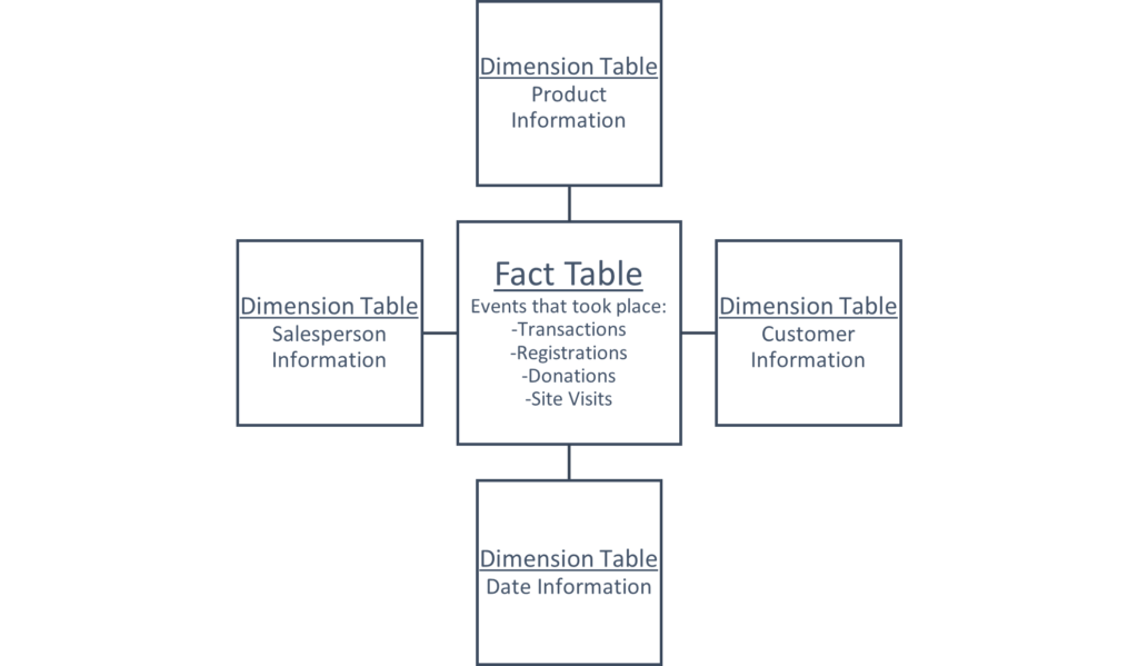
    Rather than try and fit all the information into one table, what if we split it into multiple tables? The resulting tables can follow the logic we used in Challenge 1 above – one table of events that took place (known as the fact table), and many tables containing categorized details about each event (known as dimension tables). This organization of information is called a star schema

    sche·ma 

    /ˈskēmə/ 
    noun 
    TECHNICAL 

    1. a representation of a plan or theory in the form of an outline or model. 
      “a schema of scientific reasoning” 

    Here’s the star part, with some examples of the kinds of data that could live in the star: 

    Let’s see how Table 1 from the start of this article could get split out into a star schema, while adding a couple columns for good measure ((that’s a pun for more experienced readers – ‘measures’ perform some calculations on the data) this is a joke explanation for people who get a kick out those as well).  

    When separating data into facts and dimensions, we want to follow the rule of one business entity, one table. Business entities can range from customers, to products, to workers, to teams, to projects, to buildings. Note however that it is possible to get carried away with too many dimensions. I’ll provide an example: You sell widgets at many locations, so location is an entity. You make a dimension table. Your buildings have different sizes, so size category is an entity. They have different cooling systems, so that’s an entity. They’re painted different colors, so color is an entity… these examples are more obviously specious, because we’re talking about features that businesses normally don’t run data analysis on. It’s also easy to imagine all this related data in one table describing the buildings where you make sales. It can easily be included in the same location table. 

    A Brief Summary of Normalization 

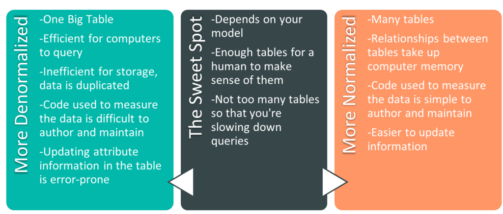
    The process of surviving high school er- I mean, splitting data into multiple tables, is part of normalization. It’s helpful to think about normalization and denormalization as a spectrum. There are extremes at either end – the One Big Table from earlier is an example of a fully denormalized model. On the other end is a fully normalized model (the example in the previous paragraph of a building size table, a building cooling system table, a building color table – that’s getting close to a fully normalized model).There are codified stages to get to a fully normalized model, called normal forms. There are six of them, and if you’re a database administrator, they’re worth knowing. In the BI world it’s more useful to understand that we can move towards either end of the spectrum to accommodate our needs. There are pros and cons on both ends of the spectrum. Let’s go over some of them. 

    Size of the Model 

    The more denormalized a model is, the more duplicate data you have. For instance, if each of my customers purchases on average 20 products a year, each of their names will show up in a fully denormalized table 20 times a year, once per sale. If I normalize the model and create a customer dimension table, each customer will only be listed once there (their name will still show up once for each sale in the fact table). If we only had one attribute we tracked relating to customer (their name), we wouldn’t need to normalize. However, when each customer also has 29 other columns with related information (remember address columns, education level, income bracket, favorite ice cream), we’re able to move all of those columns to the customer table (where each customer exists only on one row) and save an immense amount of space. As a secondary benefit, if we were to update information about a customer, we’re only updating one row. In a denormalized table where the same information is repeated on hundreds of rows, we’re updating that information hundreds of times, and hoping that the update is error-free. 

    Fewer Tables Means Fewer Relationships 

    We haven’t yet covered relationships explicitly in this series yet. For the moment, know that relationships link tables together on one attribute, so that one table can filter another table. By selecting a customer in the customer dimension table, you can filter the sales fact table and see only the sales made to that customer. Without relationships, we would need to write code to measure the data. We could still filter the fact table to see sales to a specific customer, but depending on the questions asked, the code can quickly become opaque and hard-to-maintain. 

    Fewer Tables Means Fewer Tables 

    Relationships are powerful tools in data modelling. However, they also take up space in memory (something we’ll explain in greater detail when we talk about model sizes). Additionally, more tables are simply harder to manage. I could easily triple the number of tables in the star schema example above, but I would only be making my life harder. It’s like instead of keeping your socks in one dresser drawer, you have 4 dressers, and each one has a drawer with a specific color of socks. You can imagine that this sock setup wouldn’t make it much easier to count the number of socks of each color you own, and it definitely wouldn’t make it easier to count how many socks you owned in total. Though, if you’re putting your socks in different dressers based on sock color, I’d imagine you’re the kind of person who knows exactly how many socks you own. Regardless, when it comes to data models, don’t be that kind of sock owner. 

    The Normalization Spectrum 

    After quite a bit of information ingestion, I think it’s time for some rest and integration. In the articles up to this point we’ve talked about the roots of business intelligence, we’ve presented an overview of basic data models, and we’ve added complexity to the model, upgrading it to a star schema. As a digestif, I encourage you to think about your own endeavors, and how they might be best represented in a data model. Perhaps you work for a nonprofit that deals with donors rather than customers. Maybe you perform research and deal more in instrument readings or research participants. Maybe you’re in charge of a community sports league and the players want to track their stats or better understand game attendance. See if you can organize the data into a star schema (as a note of encouragement: 99 times out of 100 the data is best represented by some kind of star schema). Get up, walk around, stretch, celebrate, and tell your favorite dog (be honest, we all have favorites) all about what you’ve learned. Come back to your notes after a day and see if you have any questions.


    Sign up to receive email notifications when we release new learning content 

    Sources 

    1. Data Modeling for Power BI – Online Course from https://www.sqlbi.com/ 
    1. https://orangematter.solarwinds.com/2020/01/05/what-is-cardinality-in-a-database/ 
    1. https://towardsdatascience.com/database-normalization-explained-53e60a494495 
  • A Key is Key: Making Relationships Between Data

    BI Discipline: Data Prep, Data Modelling
    Concepts to know before reading this article: Data Model, Fact Table, Dimension Table, Star Schema
    Concepts covered in this article: Directional Relationship, Many-to-one Relationship, Filter, Unique Key, Primary Key, Foreign Key, Natural Key, Surrogate Key, Composite Key

    New Here? Read the Post that Started it All, and check out the Learning Map


    Welcome to the 4th article in Season 1! At this point we’ve explored the world of data modelling in a broad sense. We’ve talked about some of the main challenges that data modelers need to overcome as we ask more complex questions of our data. It’s time to take a deeper dive into the intricacies of data modelling and catch a glimpse of the flexibility and power of a realized model.

    The Blue Widget Question Revisited

    At the start of this series, we imagined ourselves as a widget-enthusiast turned small business owner. We might want to know things like “what is the total of all widget sales last month?” or “what percentage of our total sales is merch?”. If those were the only question we anticipated ever asking, One Big Flat Table would be all we’d need. However, as our questions become more detailed, so too must our data model.

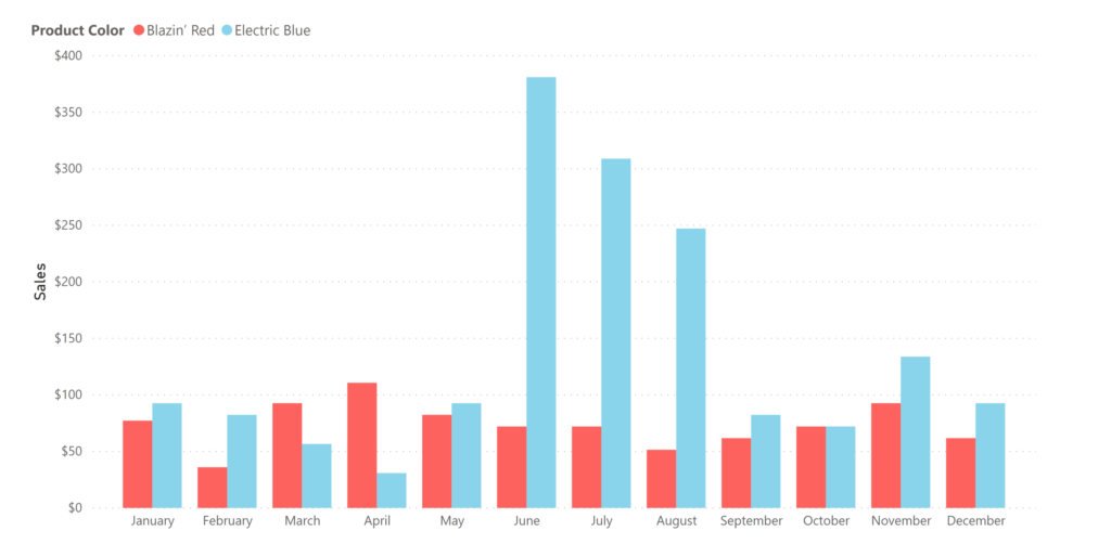
    We started this whole widget example with this premise: we have a hunch that blue widgets sell better in the summer, and we want to check our historical data to see if we’re right. Let’s up the stakes a bit- let’s imagine that we have the opportunity to go all-in on an expensive blue-widget marketing plan for June.

    On the advice of a friend, let’s say that we organized our widgety data into a star schema. Each sale is recorded in the fact table, and all the attributes that are related to each sale event (or ‘fact’) are organized into dimension tables. Then, we filtered our sales table by product, color, and month (we’ve accomplished this by creating relationships between tables in the model- something we’re about to dive into in this article).

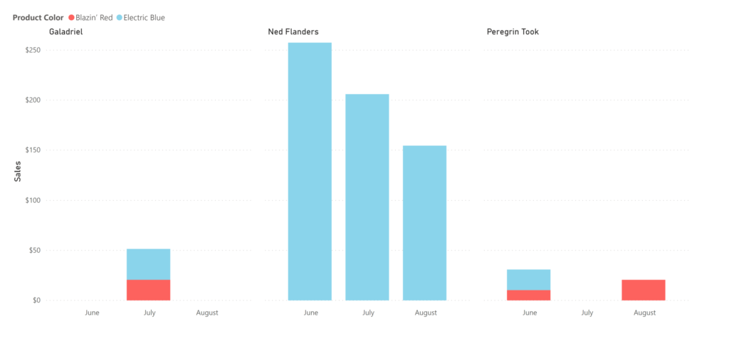
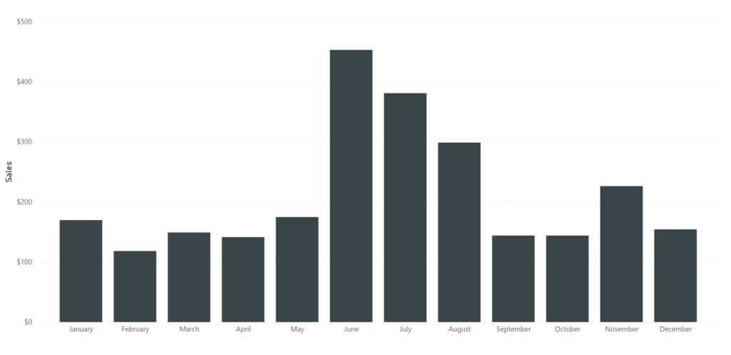
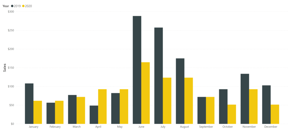
    We see now the general monthly trends of widget sales, and checked our data, and blue widgets seem to be selling at a rate of 2 times that of red widgets in the summer. Aha!

    It’s looking like it’s time to launch that Blue Widget Summer marketing campaign. We’re about to make the call and drop some real ca$h, when suddenly a breathless salesperson bursts into the room (it’s improbable, but go with me here). “Wait!” they say, “what about old Ed?” You scratch your head quizzically, but before you can chastise them for kicking the door down, they go on: “look at blue widget sales by customer”.

    So you do (which takes seconds thanks to your star schema), and lo and behold, it looks like 95% of your blue widgets sales were made to one person: Ned Flanders. Ned was 60 back in 1989 when the Simpsons first aired, which puts him at death’s door (or at least on death’s porch).

    Uh-oh. You were thinking you were going to capitalize on summer blue-widget fervor. But it turns out, Ned only leaves his house in the warmer months, and is a compulsive blue widgeteer. Good thing your salesperson has legs strong enough to kick down office doors. You make a mental note not to skip leg day at the gym.

    The power of a fully realized data model is being able to quickly investigate your data from multiple perspectives. Slicing sales by customer, by location, by date, or by product attributes is fast (‘slicing’ is a synonym for filtering data- it’ll be more clear why the verb slicing is used when we dig into data cubes). In our second article we mentioned that data models become more complex when our questions become more time sensitive. Star schemas help us answer questions quickly, taking advantage of relationships.

    What is a relationship?

    People have been trying to understand love for thousands of years, and lucky for me, that’s not the kind of relationship we’re talking about here. When I talk about relationships in this series, I’ll be talking about relationships in databases or data models.

    Relationships link two tables together, connecting a column in one table with a column in a second table.

    Table 1: A sample fact table
    Table 2: A sample (simplified) date dimension table
    Table 3: A sample customer dimension table
    Table 4: A sample product dimension table

    I’ve highlighted the relationships with blue, gold, and green above – Date with Date, Customer ID with Customer ID, and Product ID with Product ID. Column names need not match in the real world, I’ve made them match here for clarity. Take a moment and see what you can infer about the sales listed in Table 1. Who purchased what? Not every row in the fact table has visible matching rows in the dimension tables – they’re abridged in this example and would continue for many more rows.

    Sidebar: The Case of the Invisible Data, Again
    Notice how Table 2 above contains a date for which we had no sales. This is important – the date dimension is continuous, even if we don’t make sales every day. We’ll write more on that topic in the upcoming Case of the Invisible Data. For now know that sometimes it’s as important to know which days you had no sales as it is to know which days you had sales.

    Relationships allow you to filter data. Take for example a sum of sales. If I sum up my sales, I would get a single number: the combined amount of every sale ever.

    Although that’s useful on days when we’re feeling down about life, there’s not a lot of nuance there with which to make decisions. What if we summed up our total sales, but used month as a dimension? We’d then see the sum of any sale made in any January next to any sale made in any February and on and on.

    That’s getting more useful (we could examine seasonal trends over many years). It might be helpful to add year in as well, so January 2018 is different from January 2019. To get these sums, we could go in and manually add up each sale in each month, or we could let the computer do that for us by creating a relationship.

    With a relationship, we can ask for the sum of sales, and filter by the Month Year column in the date dimension. Since we’ve established a relationship, the filter travels from the date dimension to the fact table. In order for the relationship to usefully accomplish this, for each instance of Date in the fact table, there must be only one corresponding row in the date dimension table. This is called a many-to-one relationship, because there are many instances of a given date in the fact table which correspond to one instance of that date in the dimension table.

    Furthermore, filters travel one direction along this relationship, making it a directional relationship. It’s useful to see all the sales made to one customer (many-to-one relationship, where the filter travels from the customer dimension to the sales fact table). It’s not as useful to see all the customers that were part of one sale (that’s typically one). Many data modelling programs (like Power BI) require many-to-one relationships by default, and similarly require the directionality be from the one side to the many side. The result is dimensions filtering the fact table. For instance, if we have 12 sales on January 1, 2019, that’s fine. If however January 1, 2019 shows up twice in the date dimension (and thus on the axis of the resulting visualization), we have a problem – where do January 1, 2019 sales go? There are bi-directional relationships and many-to-many relationships, but these complex relationships address very specific scenarios that we’ll be covering in a separate article.

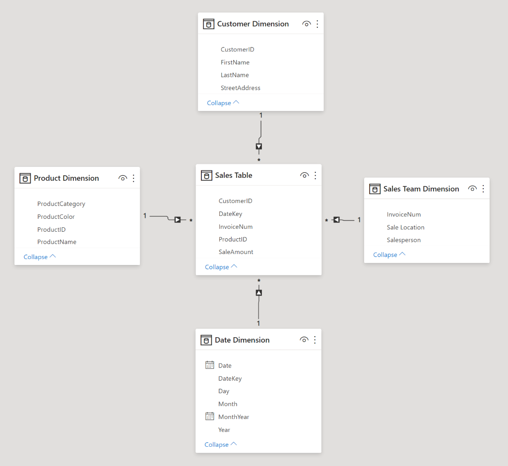
    You can see many-to-one directional relationships in Figure 1 at the beginning of this article (a star schema created in Power BI). The many side is marked with an asterisk * and the one side is marked with a 1. The directionality is indicated with an arrow.

    Where are my keys?

    The kind of gobble-de-gook that gums up the process of learning business intelligence

    To rephrase something I wrote above: each row in a dimension table must be unique (in a typical many-to-one relationship). To be unique, there must be a column that contains a unique value in each row (the column has maximum cardinality). The column that uniquely identifies each row in a table is called a primary key. Each of the highlighted columns in the four tables above are keys. There are three kinds of keys I’ll be covering below, any of which can be used as a primary key.

    Natural Keys

    Natural keys already exist in your data. In the example above, Date is a natural key. To be stored as a number, the date can also be organized in the format YYYYMMDD (June 1, 2019 becomes 20190601). In the USA where I live, Social Security Number is a natural key. Each US citizen is assigned one at birth, and each number is (supposedly) unique. When building a date dimension, date can serve as the key – there’s no need to establish a code to represent each date.

    For the customer table, you might think that full name is a good candidate for a natural key. It isn’t because names aren’t consistent (and they’re not as unique as you might think). Take Galadriel for example. If the Lady of Lothlórien wanted to go by Altáriel (as she sometimes does) and we were using name as a natural key, we would need to update that record in dozens of places in our database: once in the customer dimension table, and then again for every row in the fact table where she was the customer. It’s much easier to keep her customer ID the same and update her name. Additionally, though she goes by many names, she doesn’t have a last name. She’s a rocker like Sting, or Bono, or Cher, or Madonna. The variabilities of names can create problems in our dataset.

    Surrogate Keys

    To handle the issue with customer name, we created a surrogate key. It’s an arbitrary number and has no bearing on the world outside of our data model. It started at 1 and incremented from there. Ned Flanders might take some joy from being customer #1, but him telling me that at a dinner party wouldn’t exactly impress me.

    Composite Keys

    Composite keys are similar to natural keys in that they’re made up of real-world attributes. The difference is that a composite key is, well, composite. By combining two or more columns that aren’t themselves unique, we end up with a unique column. In our example above, instead of creating a Product Number, we could have created a composite key out of ProductName and Product Color. The result would have been a column with values like Widget Classic Blazin’ Red, and Ball Cap Acid Green. One problem with composite keys is that as you add data, it’s possible you can end up with duplicates. Perhaps we add a new product category – Convention Widgets. We sell the same widgets in the standard colors at conventions, so they’re in a different product category. Our composite key would have two entries for Widget Classic Blazin’ Red, and that would be problematic.

    Other Keys

    As I wrote above, the column that uniquely identifies each row in a table is called a primary key. It doesn’t matter if it’s a natural key, a surrogate key, or a composite key. As long as it uniquely identifies the row, it’s the primary key. There a few more definitions that are worth knowing, especially as you do more work at the data prep level:

    A column which uniquely identifies each row in a table is also called a unique key. Primary keys are unique keys, and a single table can have many unique keys.

    Any column that could serve as a primary key is a candidate key, and the ones that aren’t chosen are alternate keys.

    Each of the primary keys in the dimension tables (Date, Customer ID, and Product ID) are called foreign keys in the fact table. They’re foreign keys in the fact table because they refer to the primary key of other tables.

    Sidebar: Fact Tables, Primary Keys, and Cardinality
    The fact table in our example above (Table 1) has its own primary key, Invoice Number (which happens to be a surrogate key). If, for whatever reason, your model doesn’t capture information at the grain of individual sales, or you’re only interested in summaries rather than being able to investigate specific sales, there’s nothing inherently wrong with omitting a Invoice Number or an arbitrary key from a fact table.

    Remember, each row in a fact table does not need to be unique. In fact, compression benefits from each row not being unique. They often are – if an invoice number or sales order number is included in a sales fact table, each row will end up being unique.  Software engines are smart enough to ignore keys when compressing the data; including a natural key or adding a surrogate key in a fact table doesn’t automatically put you at maximum cardinality.

    With that, it’s time to take a break. Literally stand up (if you aren’t standing from the joy of learning already), reach for the skies above, reach for your toes, wiggle your spine, and share what you’ve learned (perhaps with a notepad or animal companion). We have one more article (I promise it’s on the less technical side) in this introductory series, where we explore more deeply the ‘why’ of BI.


    Sign up to receive email notifications when we release new learning content

    Sources

    1. Data Modeling for Power BI – Online Course from https://www.sqlbi.com/
    2. https://www.databasestar.com/database-keys/
  • Upstream Solutions to Downstream Problems

    Concepts to know before reading this article: Business Intelligence, Data Model 
    Concepts covered in this article: Why, How, What, Analysis, Synthesis 

    New Here? Read the Post that Started it All, and check out the Learning Map


    We’ve lived for a while now in the ‘how’ of business intelligence. How do we go about organizing our data into a model? What are the pitfalls to avoid, and opportunities to take advantage of? Those are good questions to ask, but it’s actually the ‘why’ of learning that feeds me. Why make a data model? Why do any of this? I want to start with an illustrative story, and then we’ll get to the lesson. 

    A Personal Story About Alligators – Why Build a Data Model 

    Remember, when I started at Source to Share I had just left the nonprofit sector, where I had run operations at an arts nonprofit for 7 years. During my time there, I learned many lessons, some of them the hard way. Simply put, our staff was overworked and underpaid. Furthermore, no matter how clearly we dreamed about renovations, updates, and expansions, the day-to-day grind seemed to always get in the way. 
    I remember when we wanted to switch internet providers to save money, and I had to figure out which of the cables criss-crossing nightmarishly around the building were part of the alarm system, the old internet system, or the CCTV monitoring system. What followed was a herculean effort to categorize, cull, and label the remaining cables. I created a corresponding cable map with the hope that some future arts-lover-turned-administrator would silently thank whoever had come before them. 

    I watched this story play out again and again while I was there. Dozens of kids were arriving to fill out audition forms for an upcoming show, and there were no pencils. I would run to the store or, if I was too busy with some other emergency, I would call someone to run to the store for me. Then, later, after a long day, we’d try to get down to the business of making sure we never ran out of pencils again. Where do we keep pencils? Who tracks them? Who purchases them? 

    I remember in the early days when we would put on a show, we’d put a call out to the community for musical directors, choreographers, and stage managers, and when people would ask what the pay was for the job, we’d have to tell them we don’t know. We didn’t know how many students would enroll, and we didn’t have a savings, and we’d only know how much money was left when the stage was struck and the dust settled. We’d try to give the prospective theatre crew an estimate or a range, but we knew in the back of our minds that we couldn’t pay professionals with money we didn’t have. 

    To quote a saying that’s been used many times in many contexts: 

    “It’s hard, when you’re up to your armpits in alligators, to remember you came here to drain the swamp.” 

    We used to talk about this idea a lot at the nonprofit. If only we could get enough help to fend off the alligators, we could finally drain the swamp, eliminating the problems at their source. Rather than constantly dressing alligator-bite wounds, we could build a better arts nonprofit. We eventually did, and I’ll explain how we did that at the end. 

    Dan’s Book and Stephen’s Blog and the Idea of Synthesis 

    When I was first starting this article series, I was deep in learning about data visualization. One of the giants of that field is Stephen Few. In my research I came across his blog, and a very powerful idea he was writing about – ‘upstream thinking’. He had just read Dan Heath’s book Upstream, and his review of it turned on a light for me. It’s a concise review, well worth the read. Here’s one quote from Stephen: 

    Essentially, Upstream explains and promotes the importance of systems thinking (a.k.a. systems science). Systems thinking involves synthesis, seeing the whole and how its many parts interact to form a system. It’s the flipside of analysis, which focuses on the parts independently and too often gets lost in the trees with little understanding of the forest.” 

    Much of our work at Source to Share is analysis. We’re analysts after all. However, analysis isn’t everything. What we do is more of an analysis sandwich, with thick slices of synthesis on either end. We’re taking in as much information as we can about the client’s needs and goals, and all the factors that are hindering them. Then we dig in and analyze how to fix each piece. At the end, it’s back to synthesis – seeing how our solutions are fitting their needs in real time. 
    How to Drain a Swamp 

    At the arts nonprofit, we were constantly bogged down trying to handle problems when a simple upstream system fix could have eliminated the downstream work altogether. We were running programs as fast as we could in order to make enough of a margin to keep the lights on. We didn’t have time to stop, look at past trends (assuming we even had the data), and build a budget with which to project earnings. If we did, we could tell people exactly what we could pay them, knowing that even if we undersold the house for a particular show, it would balance out in the long run.

    Last night, my partner and I were watching an episode of Queer Eye, and I had the realization that Tan, Karamo, Antoni, Bobby, and Jonathan Van Ness are systems analysts. They may not self-identify as such, but they each work on systems, identifying those that are causing downstream problems and creating new supportive systems for the guests on the show. Overhauling systems is a big lift, and the energy that the Fab 5 invest creates efficiencies that result in a massive long-term return. 

    For a small business, nonprofit, or a research operation, it can be difficult to implement systems overhauls. Training staff (or adding a position) to learn business intelligence or a new program is expensive. You might not have the funds to stop operations for a week and create new systems that will multiply your impact down the road. In reality, you can still make changes even if you don’t have the Fab 5. At the arts nonprofit, with every extra bit of funding or time, we worked on systems. We figured out a supply schedule and got office supplies delivered. We started tracking data and after a year, we built a budget. It wasn’t great, but the next year we had time to build a better budget. The year after that we had enough time to upgrade our budget again, and still had resources left over to make an annual report. There was no single magic fix except diligence. Small changes snowballed over time. 

    This is exactly how we work at Source to Share. With clients, we meet them where they’re at, with whatever budget they have, and implement as many systems overhauls as we can. I’ve been amazed by what Bo and Derek can accomplish in even an hour or two (I’ll get there someday!). Those overhauls increase efficiency and free up capital, allowing businesses to reinvest in further efficiencies and systems improvements. 

    Speaking of nonprofits, we do pro bono work at Source to Share as one way to give back to the community. If you’re a nonprofit professional or know of a nonprofit that would benefit from business intelligence services, send us an email or give us a call! 

    BI Applications 

    The upstream solutions ideal applies not only to where and when we work, but how we work at Source to Share. We often encounter obstacles while creating reports for clients. By addressing those challenges upstream at the data prep level or with our data model, we’re able to avoid downstream problems in measuring or visualizing our data at the report level. Let’s look at a generalized example of how this plays out… 

    Having better data models means less complex DAX code (or whatever code you’re using to measure your data), less DAX overall, and less processing load on your computer when you evaluate expressions. Plus, complicated DAX is just harder to maintain. We’ll get into the technical details in our upcoming series on DAX fundamentals. For now, know that measures create CPU load whenever the system is queried (which can happen often as an end user explores a data model), and calculated columns take up space in RAM while also increasing the file size – both finite resources. 

    By building complexity into the data that’s loaded into the model, rather than into measures performed on the data, the work is being done when Power BI (or whatever BI service you use) refreshes the model, ideally at 3 or 4am each day. Then, when the user is exploring the data, the simplified code is evaluated quickly; the user won’t need to wait as the engine does complicated calculations on 600 million rows. Performance increases and the user can get back to doing the work that they intended to do. 

    Think of it like trying to build a home with the screwdriver in your pocket rather than going out and buying (or borrowing from the library!) an electric drill. They both work, and even though the screwdriver is immediately at hand, you’re going to save yourself hours and hours of work if you invest a little bit of time or money into the electric drill. 

    In Conclusion – A Summary of Season One 

    This brings us to the end of Season 1! In this season, we’ve taken a broad view of business intelligence in five articles: 

    1.1 – The Post that Started it All: What is Business Intelligence? 
    1.2 – What is a Data Model? 
    1.3 – The Challenges of a Single Table, or: A Star is Born 
    1.4 – A Key is Key: Making Relationships Between Data 
    1.5 – Upstream Solutions to Downstream Problems 

    These articles covered the upstream concepts and principles that will remove downstream problems for you as you grow in this field. I’ve included a summary below, telling the story in brief while highlighting the important concepts in bold: 

    We talked about the four broad disciplines of BI: Data Prep, Modeling, Measurement, and Visualization. Then, we learned how data fits into tables which evolve into data models, starting with basic denormalized tables. These single-table models could be all you need to answer your questions, but they can also grow past limitations to become star schemas–this process is called normalization. The process separates data into fact tables and dimension tables. In order to understand why tables can grow long (but not wide), we learned about cardinality and columnar storage. Our new star schemas rely on relationships between tables in order to filter the data, and so far we’ve covered directional relationships and many-to-one relationships. These relationships connect tables using keys. We learned the different names for keys we might encounter out in the wild. Finally, we spent some time discussing the whyhow, and what of BI, pairing these tools with real-world needs. In doing so, we learned a new way of understanding BI work: as a combination of analysis and synthesis

    We’ll be diving into more of the technical bits in future seasons, and as we do, I encourage you to keep the underlying purpose of BI in your mind: 

    “Business intelligence is about having the right information at the right time in order to make informed decisions for your business.” 

    -Me, from “The Post That Started it All”

    It’s easy to get lost in maximizing a formula or creating the ‘perfect’ data model (if you ever see one, please send it to me). What’s harder is keeping the purpose of BI close at heart, and doing no more and no less than is necessary to move your endeavor forward (or help your client do so). 

    Thank you for taking the time to invest in yourself by reading these articles. By participating, you not only broaden and enrich the field, you also honor my contribution. You’ve taken the first steps along a profession that’s having a profound impact on the world. We’re in the business of efficiency, of eliminating wasted effort and resources, and creating clarity. In a literal sense, we’re on this journey together. I’m writing as I learn, and I’ve already started work on season two. I hope you’ll join me.


    Sign up to receive email notifications when we release new learning content 

    Sources 

    1. Stephen Few’s blog: http://www.stephen-few.com/blog/2020/04/14/upstream-thinking/ 
    1. Data Modeling for Power BI – Online Course from https://www.sqlbi.com/